


Ah...what's so wrong with the border?Originally posted by Zedaxax@29 July 2004 - 06:45
minor improv

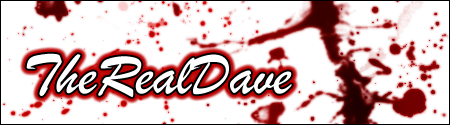
Bah...anyways, in the process of making a new sig.


 BT Rep: +9

Ah...what's so wrong with the border?Originally posted by Zedaxax@29 July 2004 - 06:45
minor improv

The writting looks blurry to me but thats only my opinion, plus i cant read hardcoregamers writting either
BT Rep: +9
Bah, here's a new one, this one probably ain't much better.

sparsely likes it much better
this post is guaranteed 100% parrot-free
BT Rep: +9
If Sparsely is happy, then I'm happy.Originally posted by Sparsely@30 July 2004 - 19:58
sparsely likes it much better
this post is guaranteed 100% parrot-free
BT Rep: +9
Tweaked it, yet agian.")
I quite like it.. good job
BT Rep: +9
Thank you Dave. And would you belive this is only my second project?
It's very impressive for your second project!!
My blood effect is just a bit taken from website I'm going to start. For the effect I did something like this (can't remeber completely because it was a while ago).
- got some blood brushes from http://www.deviantart.com
- with a red of #DC0909 i created the blood splatters with the brushes
- I then coppied the layer of blood splatters and added a gaussian blur with a blur of 1.0
- I then copied the blured layer then going to Image>Adjustments>Brightness/Contrast and lowered both brightness and contrast (not sure what to though)
Layer3 - #DC0909 - Blurred - Brightness/Contrast
Layer2 - #DC0909 - Blured
Layer 1 - #DC0909
Just play around with that kind of setup and see what you get
 Posting Permissions
 Bah...anyways, in the process of making a new sig.


 Reply With Quote

")


Bookmarks