


hahha true


 BT Rep: +5


does wonders for your motivation
BT Rep: +5
weeeeeeee i fixed my avatar it looks better i think its a little different color scheme but it works for me
do you guys like it i made it myself?
 BT Rep: +3

could you fix it by adding Stroke on the letters? my eyes areto read it.
BT Rep: +5
i did a stroke of 1 i guess i could do like 2 but i didnt want it to like attack you or something should i use black or do you have any other suggestions maskawaih
Originally Posted by KwahyaJ
looks fine to me!
damn claen the resin of your screen!
BT Rep: +3
use bright color of stroke.
but that just my opinion.
BT Rep: +5
i think a bright color would make it harder on the eyes
BT Rep: +3
i mean for stroke. just put it 1 or 2 pixel stroke with bright color.
it's good, hard on the eyes, but i like it
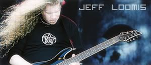
Jeff Loomis: He's so good, he doesn't need to be dead to have a tribute.
 Posting Permissions


 Reply With Quote

 to read it.


Bookmarks